
I am thinking of changing my URL for slightly better anonymity. I've been thinking of it for a long time but I can't get past the maintenance I'd have to do. not much else would change, maybe some light generalizing of a few pages. seems like a lot of effort tho
5 likes
11 likes

5 likes
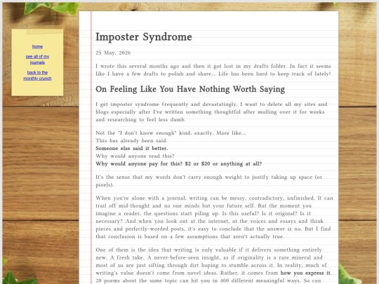
I made that imposter syndrome post mostly for myself for times like right now when I'm having it super intensely (:
4 likes
 crunchweb
3 months ago
crunchweb
3 months ago
One of my presentations at work got some attention and then I shared it with a super high level person and made a recording and I feel very vulnerable and seen and like they're definitely going to find out it's all BS... Even though it definitely isn't. I researched that shit forever
2 likes
crunchweb
3 months ago
well not forever but a couple weeks and that's really the longest I've ever done for a presentation that was supposed to be for a group of 15 people and never seen again. I'm proud but also hate this feeling
2 likes
crunchweb
3 months ago
I got a lot of compliments on it. so I opened some minds and that's really cool. but my brain still does punishment
1 like
6 likes

2 likes
I still don't totally like the new update, I'm way less likely to browse global activity for new sites to enjoy. it's just too overwhelming :( which I guess on the flip side is good because I'm spending less time online
3 likes
 stoneroad
4 months ago
stoneroad
4 months ago
I find pros and cons with it. Sometimes sites will update like a dozen pages all at once (guilty as charged), and then it becomes really overwhelming. But under the majority of circumstances, I feel I click on more pages then before because I can see all of the pages someone updated rather then just the featured one.
1 like
crunchweb
4 months ago
I've sort of already trained myself to stop looking at sites when they become overwhelming. I mean it was one of the ways that I stopped using social media. unfortunately I'm not interested in going back 🥲 hopefully we'll get the option of themes or something. a lot of the problem I have with it is the colors chosen.
stoneroad
4 months ago
interesting? Do you have any thoughts on colors you would have chosen instead or what changes you would make?
1 like
crunchweb
4 months ago
I don't know what colors I would have chosen but I have been thinking about it the last few days, and I think my problem with it is the color contrast, but how widely they contrast. The red borders around profile pages when you update your site draws your eyes, but then the low contrast behind comments is weird. I think I would bind full comment threads, not just the replies.
crunchweb
4 months ago
also the colors don't really mesh very well with the heading colors. overall I feel like my eyes are just darting back and forth trying to figure out what to focus on, so it doesn't feel like I'm fluidly reading comment to comment, update to update, etc. it's just too much effort to look at the site now.
ew
7 likes
5 likes
crunchweb
4 months ago
the red boxes look more indented to me so then I get confused about what the timeline is showing me like why is this person's site update nested under this person's comment oh wait it isn't.
3 likes

3 likes
crunchweb
4 months ago
@ladyinbed I sort of like that the replies are indented and they looked different. but I don't like how they look. and I also wish the site updates were grouped with arrows to scroll through them rather than stacked.
4 likes
1 like
stoneroad
4 months ago
it's common to dislike sudden change, but after a few days I'm fairly confident I'll barely notice them.
1 like
 sclptures
4 months ago
sclptures
4 months ago
@maxcrunch i love this update, but agreed that the page previews are a bit overwhelming
1 like
crunchweb
4 months ago
so this morning it looks very different, I do like the adjustment to the thumbnail sizes. they were just too big and they would make me kind of dizzy as I scrolled, I wonder how much thought was put into accessibility and different user needs for this update... but at least it seems to be iterative, maybe some changes are still coming. the red border around the icon with site updates still really messes with my head.
1 like
crunchweb
4 months ago
change does usually take most people a couple days to adjust to, but I still haven't adjusted to major UI changes in my phone from last year. I've had to adjust accessibility settings every time the default UI changes on my phone. wish I could do that here too.
1 like

1 like
crunchweb
4 months ago
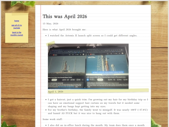
@underwhite super new it's been propogating out to keyboards since Apr 2 when my friends first noticed and all texted me but I couldn't see it yet. also Bigfoot


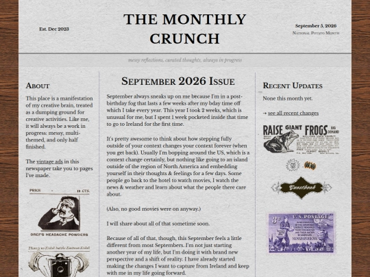
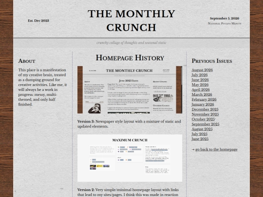
I like the newspaper on the main page so I'm not going to get rid of that! but I sort of want to go back to some of the original ideas that I had for this website. it was fun to have an expanding site that had a bunch of useless information on it. (:
also, space layout 🌌🌠🧑🚀