
sick sad library
128,830 views
247 followers
4,636 updates
0 tips
still trying to decide how I feel about the new UI on here. I actually really like it aesthetically, but for some reason I also find it more overwhelming/exhausting to look at, and I'm finding myself less excited to look thru everyone's updates unfortunately :( maybe somebody who knows more about web design might know why it's having that effect... also maybe it's just me, idk
8 likes
13 likes

1 like
 sicksadlibrary
4 months ago
sicksadlibrary
4 months ago
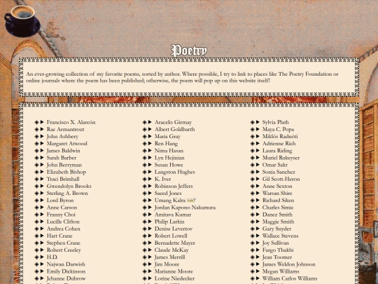
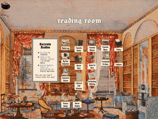
@altalenae thank you! :) btw the poetry page on your website is so amazing, I love how you sort it
9 likes
15 likes
9 likes
9 likes
13 likes

2 likes


I've noticed it depends heavily on the number of pages someone updates all at once. If they update 2 or 3 or 4 it's amazing because I can see what all of them are. If they update a a lot more then that, then it becomes overwhelming because of how much space it takes up.
I like the simplistic style. Just wish it had more color it feels so odd having so much white everywhere
Interesting, I thought it actually has more color then the old layout? Strange...
ribozone shared a stylesheet which makes the update images smaller and the comments background back to white! highly recommend > https://ribo.zone/free/snippets/userstyles
@stoneroad maybe I’m misremembering? I haven’t found screenshots of the old one to compare it to but I remember there being color around account usernames.. I might be wrong