
4 likes

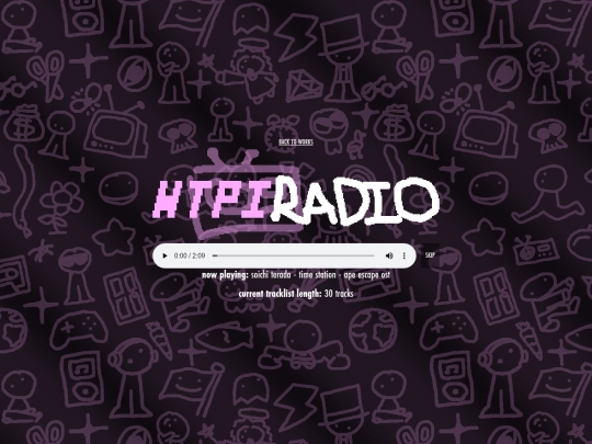
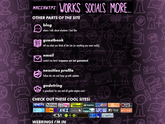
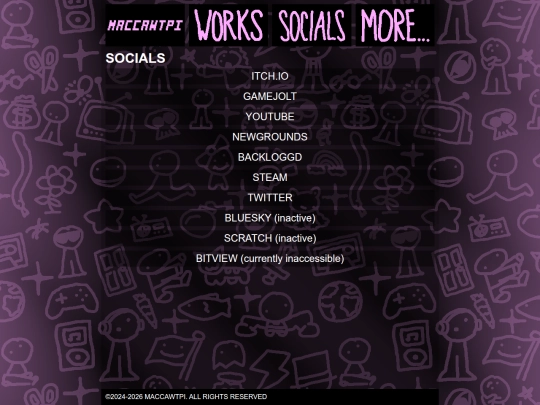
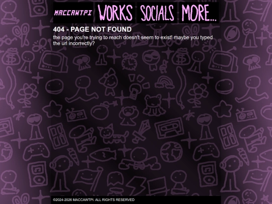
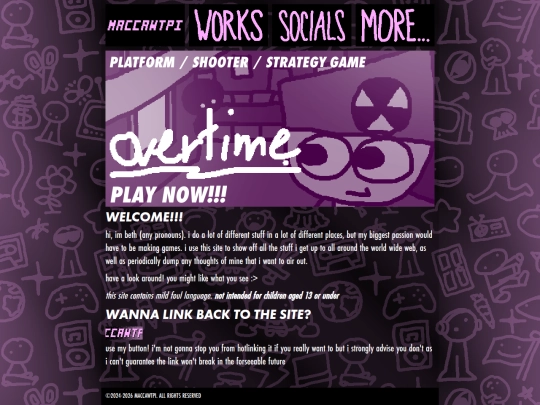
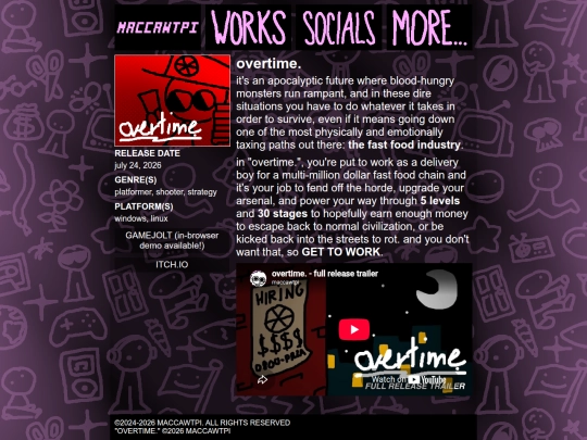
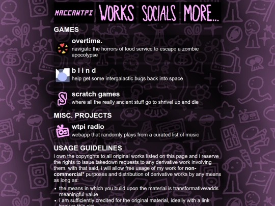
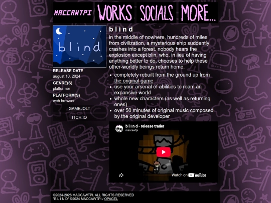
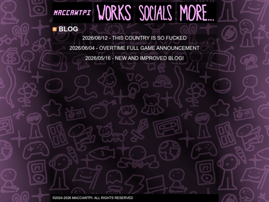
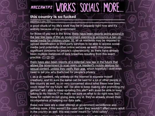
https://files.catbox.moe/3fbf5w.png https://files.catbox.moe/mvzpl5.png https://files.catbox.moe/e7yjib.png decided to go a lot simpler with this new design while still giving it the same kinda vibe as the old one. also made extra sure it looks good in both chromium and firefox
am i cooking or am i cooked
4 likes
1 like
 wtpi
4 days ago
wtpi
4 days ago
@kanandraw what is it about this layout you don’t like / prefer about the current layout? just out of curiosity
1 like
 dragonaero
4 days ago
dragonaero
4 days ago
You’re cooking :) Only nitpick is that the maccawtpi logo’s height is inconsistent with the rest of the header buttons
 kanandraw
19 hours ago
kanandraw
19 hours ago
@wtpi sorry for the late reply buuuut idk the old design had a bit more stuff into it idk if its just me but it felt a bit more complete
just looked at my site in a chromium browser out of curiosity. wow this looks like ass
i know i've only had this design for like 4 months but it's honestly making me consider redoing the whole site again
2 likes
dragonaero
1 week ago
honestly i think your site looks fine even on a chromium browser. the only major difference i notice between firefox and chromium is that the fonts are different
wtpi
6 days ago
@dragonaero im still not that happy with how it looks. it's mainly the gigantic scroll bars that are doing it for me
dragonaero
6 days ago
I didn't notice the scrollbars. But either way they don't look too different between Firefox and Chrome FIREFOX: https://file.xobyte.org/8ad3e7a6-7875-425a-b509-d196478be63a CHROME: https://file.xobyte.org/bab89a78-793a-4aaa-8a62-d43f74295940 And I think you can customize the scrollbars with CSS too: https://developer.mozilla.org/en-US/docs/Web/CSS/Guides/Scrollbars_styling
dragonaero
6 days ago
Ultimately, it is your site and I'm don't want to pressure you into doing anything. I just wanted to share my thoughts, that's all
2 likes
2 likes
1 like
genuinely one of the most unique sites ive seen on neocities, both in how it was made and how it looks. i will be watching this site's progress very closely :>
3 likes
don't forget that they call you bud because you're weiser
3 likes
5 likes
3 likes
1 like
1 like
Website Stats
Last updated
15 hours ago
CreatedSep 30, 2024


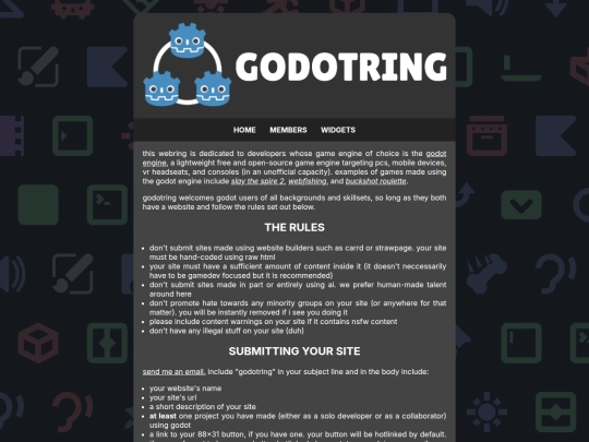
added these sites to the button horde: - https://7vtia.nekoweb.org/ - https://ioxtv.co/ - https://shpeck.neocities.org/ i also did some small changes to the fonts behind the scenes which is why the radio also got updated