
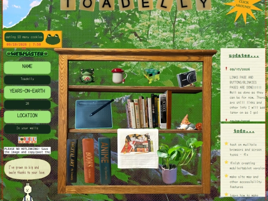
It looked good on desktop but the moment its viewed from a shorter (height-wise) screen it looks awful 🫠 and when i fix it on that view it looks bad the other way🥴 do I have to have a media query for every possible screen type;;;;;;;;;
3 likes
 toadelly
2 months ago
toadelly
2 months ago
I've been working on responsive for the index page. In the processing of pushing to live but its still broken please ignore lol
2 likes
toadelly
2 months ago
!!!!!! On my browser and phone it's working!!!! I haven't tested it on any other screen/device yet so if you see any issues do let me know! I'm still struggling to grasp aspect ratios lol
2 likes

1 like
3 likes
toadelly
2 months ago
updated: - welcome page memo - status, currentlies, and updates I'm working on a responsive version of my index page and still working on perfecting the aspect ratios for the homepage responsive code. I've also begun work on other pages I'm hoping to add soon!
(feel free to delete this I just don't know where else to put it) Thank you!!! Looking at your code really helped me get past the walls I kept hitting trying to get my responsive code to work! Mine is still a mess but it's at least mostly working now :D You did an incredible job on yours!
2 likes
 tabf5
2 months ago
tabf5
2 months ago
Thank you! I'll leave this up actually, but I honestly thought my CSS breakpoints were kind of a mess, but they do work alright. (Most people do it by pixel width which didn't make sense to me because apparently 1px on a browser isnt the same as 1px on a phone, so I just mainly did it by aspect ratio from resizing the window)
1 like
3 likes
toadelly
2 months ago
I’ve completely revamped the home page layout! I got responsive to work in my editor so I’m moving it over to live now to fix the issues I’m sure exist XD ive already noticed mobile is being unfortunately weird 😩.
1 like
toadelly
2 months ago
ok I think I have mobile functioning for the homepage? Please let me know if it looks weird on other devices!
1 like
tabf5
2 months ago
I think you almost got it! I got the Under Construction mobile layout right away until I made my window shorter and/or wider. Maybe have that trigger on a more square or narrower aspect ratio?
1 like
4 likes
2 likes
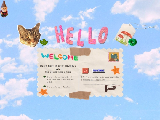
i adore the wiggly "hello" text on your index page it's SO CUTE
3 likes
toadelly
3 months ago
Thank you!!!!! I actually drew and cut them out of paper and scanned them in XD I love the tactile images on your site.
1 like

1 like
Starting over my responsive code attempt for the FIFTH time 🫠 why is this so hard? Going to try with multiple separate css files this time.
2 likes
tabf5
3 months ago
CSS gets so hard the longer a file gets, I can get lost pretty badly in the giant list of rules
2 likes
toadelly
3 months ago
Yes! ;-; I’ve been getting so lost in the sauce and overwhelmed by all the rule sets. I’m hoping splitting it up into different style files will help! Your site looks great on mobile. I hope I can get there too!


![[ Aegi's Cafe ]
avatar](/site_screenshots/40/61/aegi/index.html.50x50.webp)


Wait till I tell you how it looks on my 3440x1440 screen SPOILER: GOOD
One idea tho is to have a fixed margins so that resizing windows doesn't affect or resize the content
Hahah thats good to know! When I looked at it on a macbook screen all the postcard text got jammed together and illegible unfortunately 😩 will fixed margins remove all responsiveness?
It shouldn't. I use margins so my site looks pretty similar on all screens just have extra space on the sides if the screens are bigger or no space on the sides at all of they're smaller screens
Okay! I’ll give that a try! 🫡 thank you!