
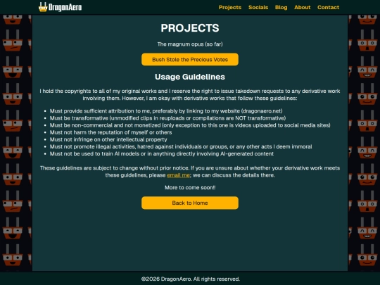


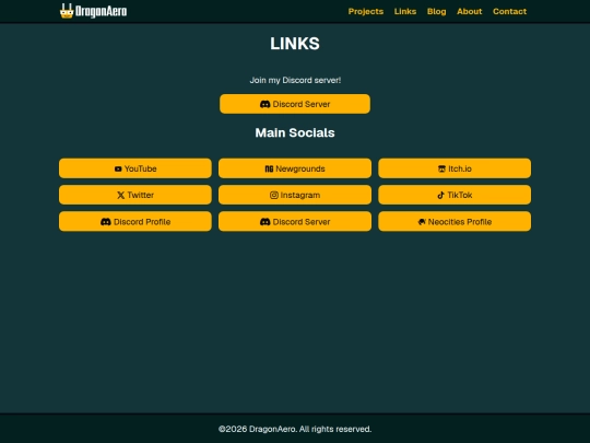
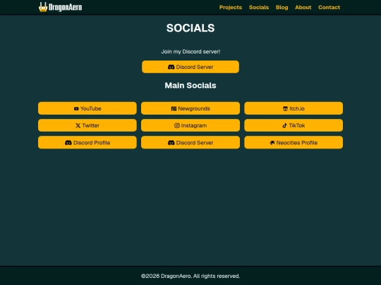
Just curious: what do you guys think about my site design so far? I will admit it's a bit basic compared to the insane shit some of y'all are cooking up but I'm hoping it's at least not an eyesore to look at 🙏🙏🙏
5 likes

1 like

1 like

1 like

1 like
 kanandraw
3 days ago
kanandraw
3 days ago
I think it looks really cool compared to what you had before (when you started to follow me i think ur site had a lack of content and a really bland design)
1 like
1 like
 dragonaero
3 days ago
dragonaero
3 days ago
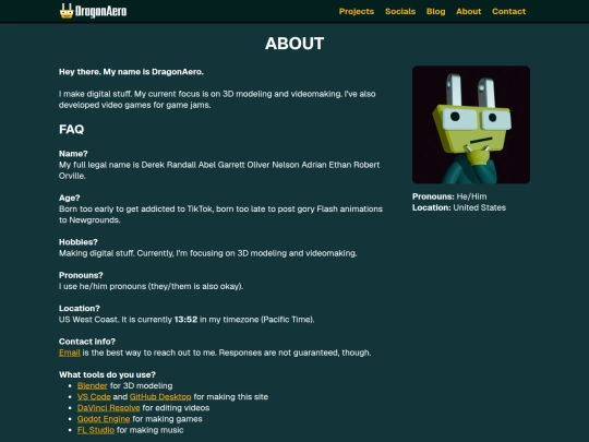
@diamond-brain yeah the button clutter is something I aim to cut down on. What if I add a secret page with a shit ton of buttons tho 🤔🤔🤔🤔🤔
3 likes
dragonaero
4 days ago
IT WORKED! I AM WINNING! MY SITE NOW HAS A RESPONSIVE HEADER WITH FULL MOBILE COMPATIBILITY!
2 likes
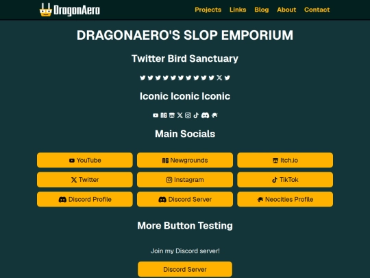
My body text font size is 16px because afaik that's the standard. It's kinda small on my monitor, but then again I have a giant ass monitor lol.
Is my body text too small on your monitors (especially at default 100% zoom)?
2 likes
 unofficiallyeternal
1 week ago
unofficiallyeternal
1 week ago
It looks fine for me. I believe there's a property called vw that changes text proportionally based on the screen, that might help.
1 like
Happy ⑨/⑨, folks!
https://www.youtube.com/post/UgkxCmKkMsZ83XphOiL8P58B3OUqpeQeGNuC
4 likes
wassup my gnghis khans
sub to my yt channel https://www.youtube.com/@DragonAero/
i'm almost at 2K subs 🙏🙏🙏🙏🙏🙏🙏🙏
3 likes
https://www.youtube.com/watch?v=tJEIWu5ykt0
This is an interesting watch as someone who wants to make their own animated skits
4 likes
 tabf5
2 weeks ago
tabf5
2 weeks ago
strange guy but his points are valid. indie animation is just the way it is because no one with an outsider perspective to artist communities can afford to hire animators to bring their ideas to life
2 likes
Website Stats
Last updated
13 hours ago
CreatedOct 24, 2024


Testing out a new background for the site as part of an attempt to make my more visually appealing (per @wtpi's suggestion). Lmk what u think :)
Only downside to the new bg is that it's not visible on mobile unfortunately (it gets hidden behind the main div, which takes up all of the width on mobile devices)
https://file.xobyte.org/80b58fd3-fcaf-4bd5-a20c-4ea07b31783e
ouuu that looks dope as hell !!